Have you heard any of the following statements from within your team or anywhere else in your organization?
- “The feedback loop is too long.”
- “I’m not sure what tests we’re running.”
- “I don’t know where our test results are.”
- “I don’t understand our test results.”
These kinds of questions typically mean that you’ve successfully adopted CI/CD ways of working within development, and automation is freeing up your time for further improvements. But how do you answer these questions before they become real issues and people start to lose interest?
Luckily, the answer is within your reach! You need to define relevant metrics and make them visible to the whole organization, specifically your team.
What metrics should I have?
We get this question a lot. Unfortunately, the answer is the infamous “it depends.” It’s better to show something than nothing, so simply start somewhere.
Once your organization is capable of collecting, storing, and presenting data, you typically begin to realize what metrics are needed. “Well, that’s not really helpful,” you might be thinking. That’s why we want to present an interesting article we came across. In it, the authors present the following metrics:
- User sentiment
- Defects found in production
- Test case coverage
- Defects across sprints
- Committed vs. delivered stories
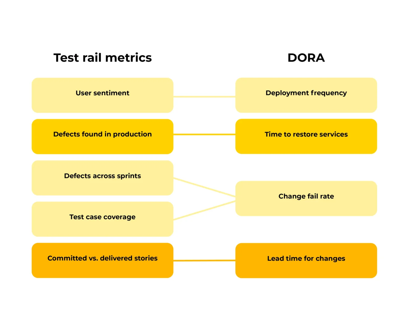
When looking at these, we noticed some overlap with DORA metrics.

Deployment frequency
This should correlate with high “(1) User sentiment.” In fact, it’s a precondition before you can even observe it.
Lead time for changes
This tells you how quickly you can go from an idea all the way to production, which is the same as “(5) Committed vs. delivered stories.”
Change fail rate
This tells you how many defects you have found and how long it took you to fix them; in other words, “(3) Test case coverage” further enables you to analyze the root cause of your change fail rate.
“(4) Defects across sprints” is a more fine-grained example of the general fail rate.
Time to restore services
This tells you how quickly you can resolve production incidents, which is the next question after you’ve found out “(2) Defects found in production.”
Given the overlap and the fact that DORA metrics have been proven to work, we consider these as good ones to start with.
Where to start?
Now that we’ve defined several reasonable metrics, how can we collect them?
At Eficode, we believe in automation and that the data in reports and dashboards should be as real-time as possible. So, a few years ago, we started a couple of open source projects to support these kinds of initiatives:
In our customer cases, Jenkins CI has been the most used CI/CD solution, and we’ve already had a successful proof-of-concept when doing metrics with an open source time-series database called InfluxDB in combination with another open source tool, Grafana, which is for building dashboards.
Using open source solutions might need a bit of elbow grease, but they are the cheapest option by virtue of being entirely free. This helps you get going faster—remember, you want to start seeing data so you can evolve your metrics further.
Example of setup:

How to proceed once we have data?
After we’ve set up the infrastructure to start gathering data and visualizing it, we typically create a few graphs to answer some of the most asked questions. For example, “What is the pass ratio for the tests running in continuous integration (i.e., change fail rate or defects across the sprint as mentioned earlier)?”
The data comes directly from your CI/CD tool, so it’s as up-to-date as it can get. And if your data is visible to everyone, your team will have a better chance of comprehending the current situation.

The next step is to start thinking with your stakeholders about the product that you and your team are building. Not all data is as important to everyone. For example, managers want to see the overall pass ratio from the month period, whereas developers want the latest results and to know whether the environment is passing smoke tests.
Luckily, Grafana and other solutions support multiple dashboards. This way, it’s easy to visualize separate metrics for management, team leads, QA teams, etc.
We recommend the practice of providing essential data to each stakeholder while allowing the option to see all of the data when needed.
We’ve often seen that once you start showing current data, more ideas emerge about what should be tackled next. Most often, this leads teams to start making decisions based on facts rather than pulling reasons out of thin air.
Why not increase your knowledge further by learning about building quality in your software?
Author

Joonas Jauhiainen, DevOps Lead
Joonas is a DevOps lead with experience in telecom, banking, insurance, and manufacturing, among other industries. His hobbies include investigation of IT devices, developing games and other SW projects not to mention underwater rugby!
Eficode is an Exhibitor at EuroSTAR 2024, join us in Stockholm.


